UX EXAMPLES
I prioritize user-centered design in all my projects, ensuring that a clear and comprehensive understanding of users, their tasks, and their environments guides my entire design process. This approach is the cornerstone of my work, driving me to create solutions that are not only functional but also intuitive and valuable to the end users.
My experience covers every stage of the design lifecycle. It begins with in-depth user research, where I delve into understanding the needs, behaviors, and pain points of the target audience. This foundational step is critical as it informs the subsequent phases of the project. With this knowledge, I move on to defining business requirements, ensuring that the design aligns with organizational goals and user needs.
Creating design solutions is where I bring creativity and technical expertise together. I employ various methodologies and tools to develop prototypes and interfaces that are both user-friendly and aesthetically pleasing. Throughout this phase, I constantly iterate based on feedback, ensuring that the design evolves to meet the highest standards of usability and functionality.
The deeper my insight into the user, the better I can empathize with their needs, values, and limitations. Understanding the user at a granular level allows me to design experiences that resonate deeply with them, enhancing their interaction with the product. This empathy is reflected in my work and is a testament to my commitment to user-centered design.
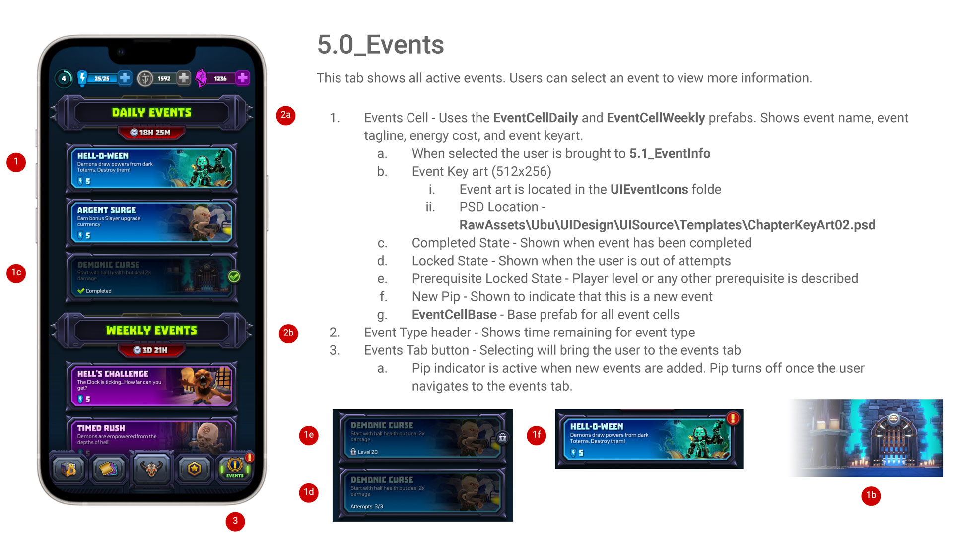
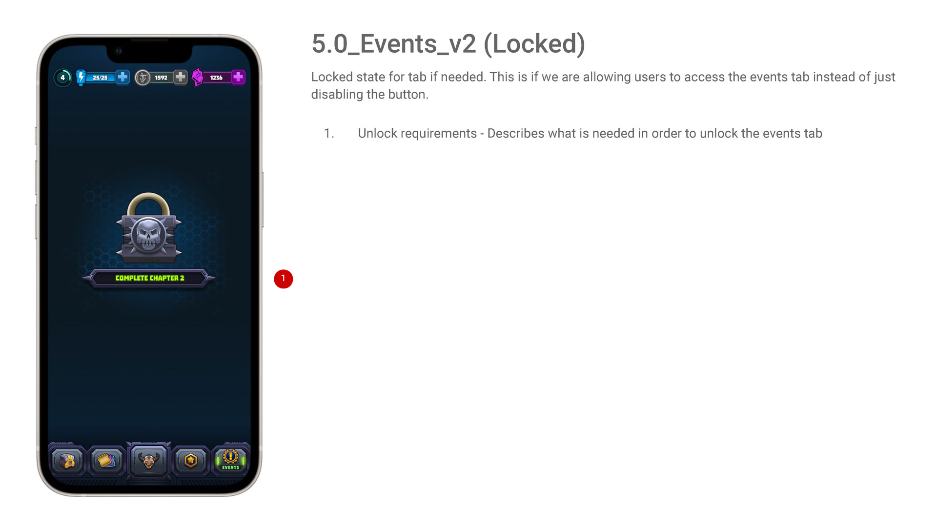
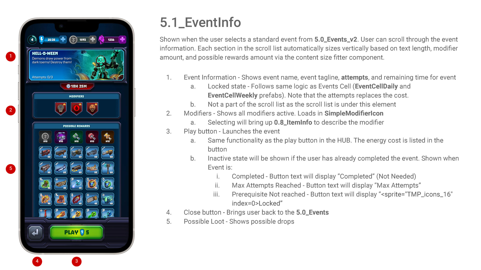
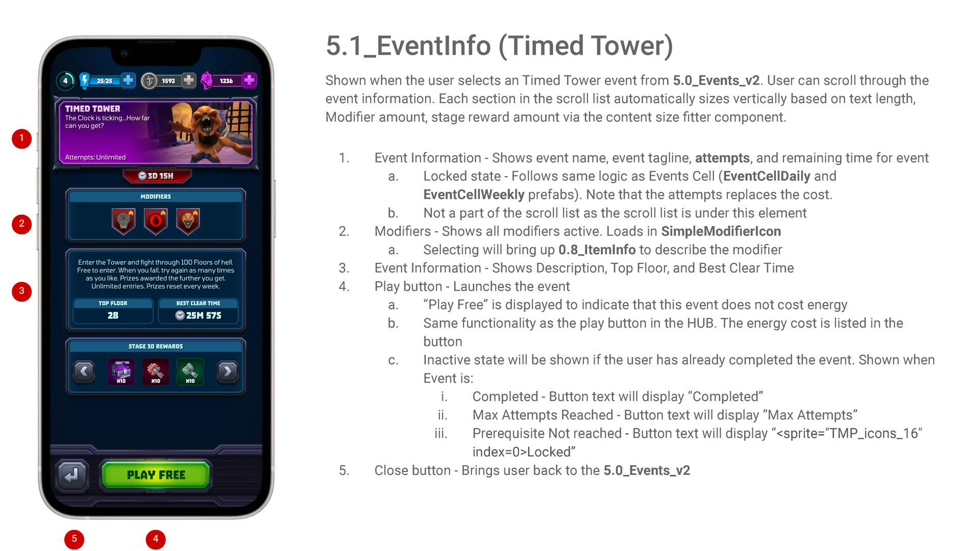
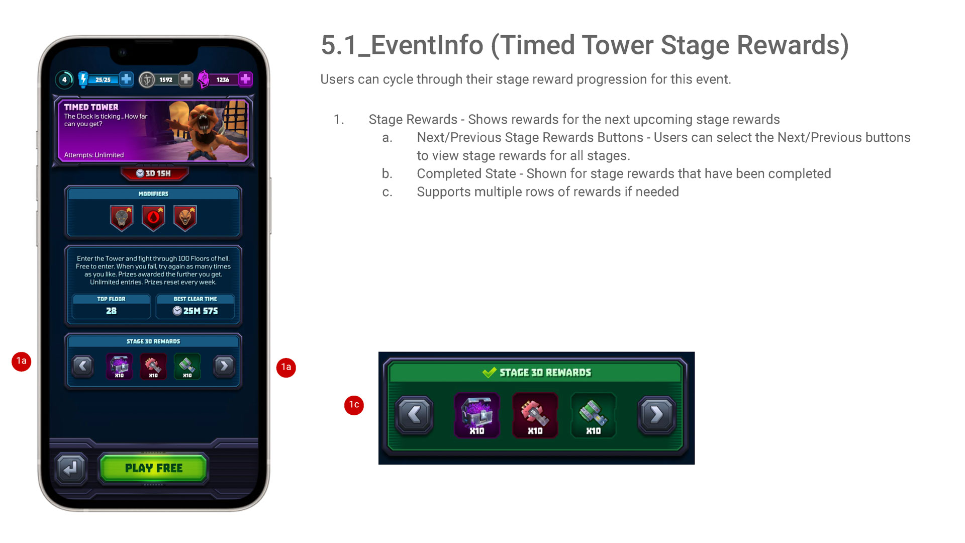
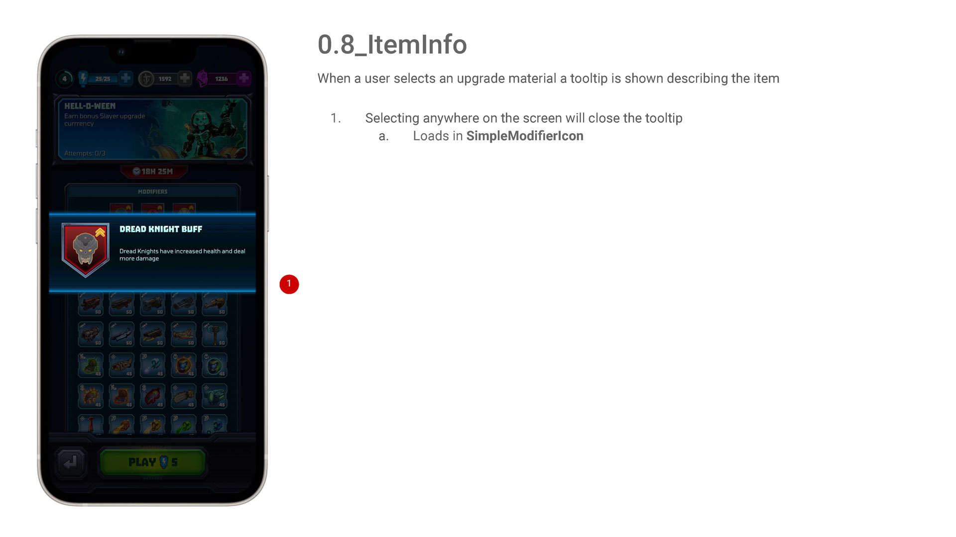
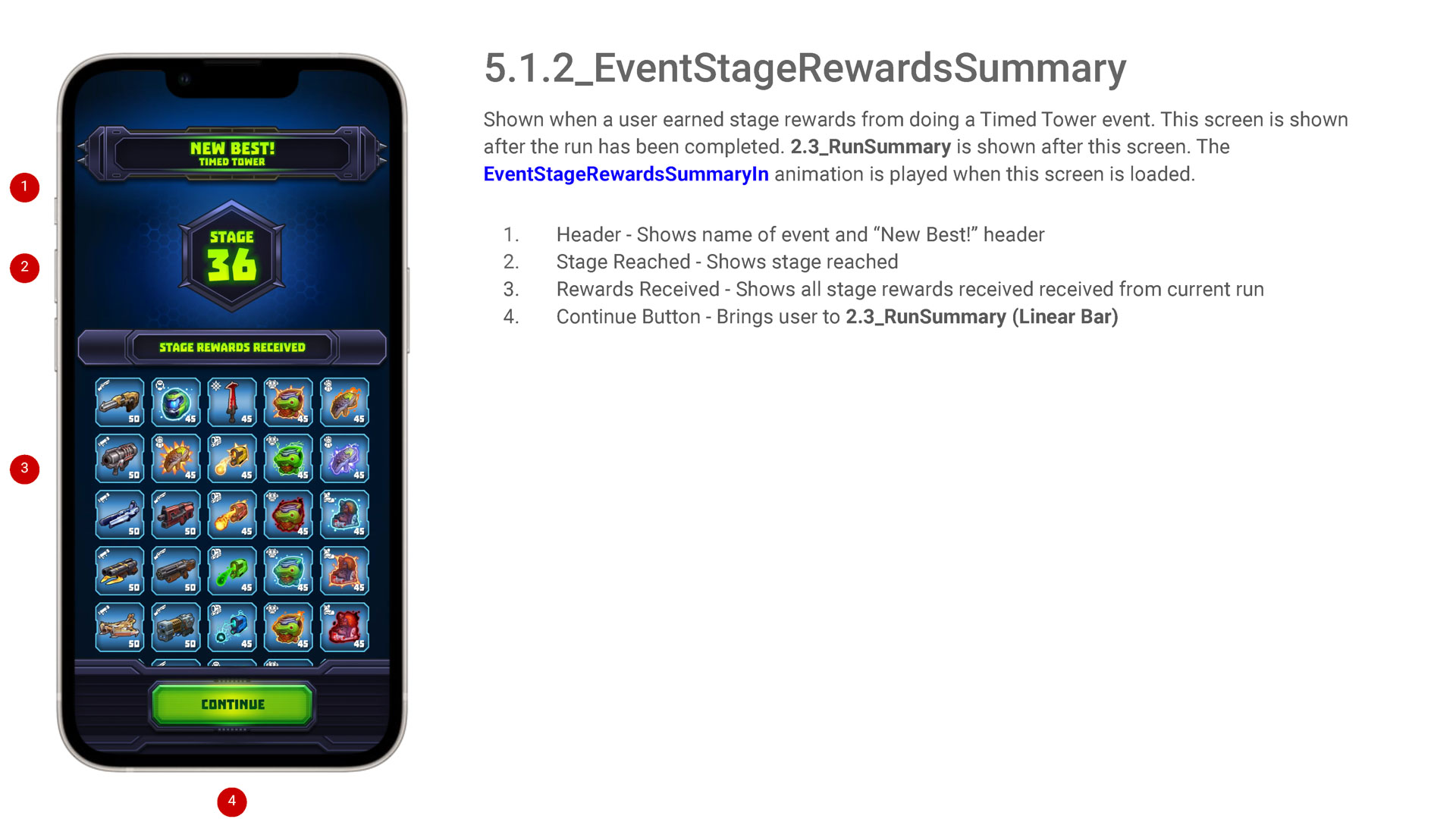
Below are some examples of my UX work over the years, showcasing how I have applied these principles to create impactful and user-centric designs. These projects illustrate my comprehensive approach and dedication to delivering exceptional user experiences.
BEYOND THE DEAD
User Scenarios
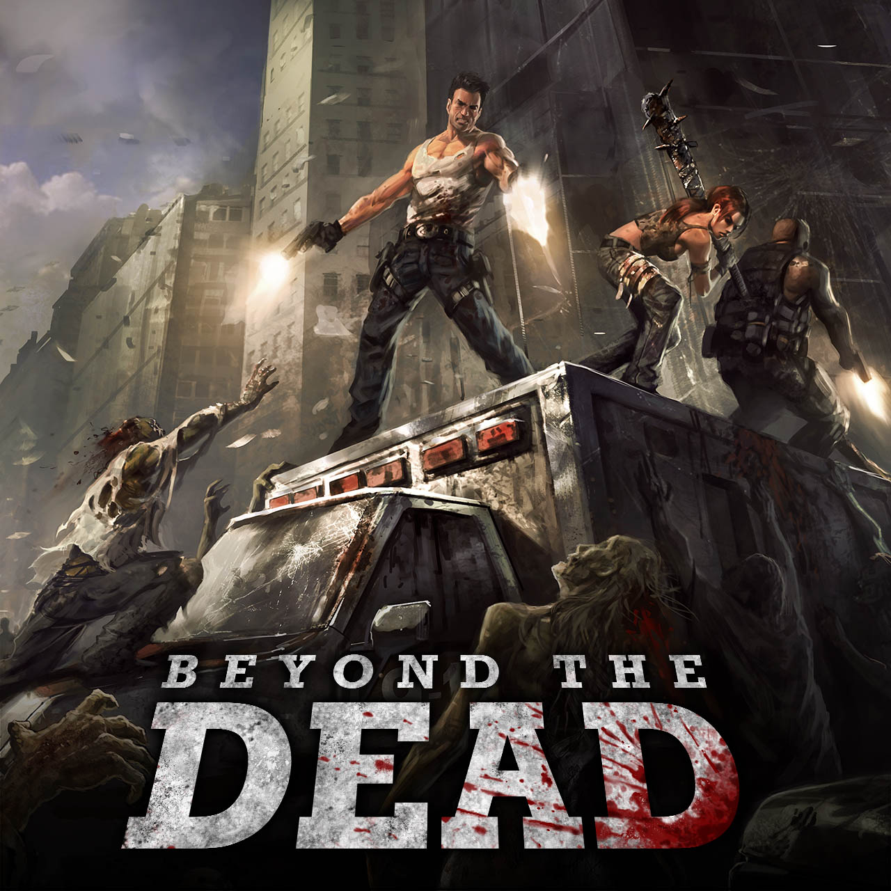
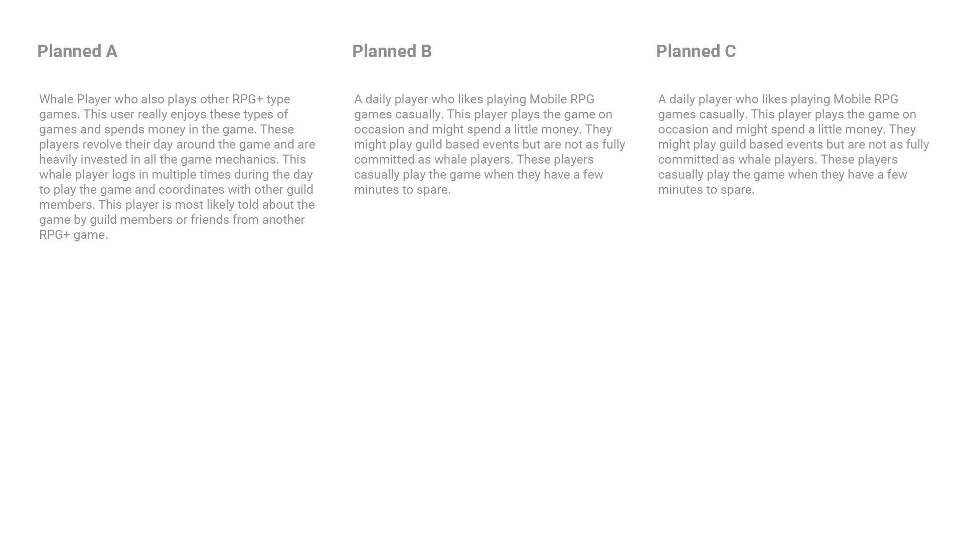
Crafting user scenarios during the ideation phase helps define their goals and motivations, guiding the UX design process. For example, in my work on “Beyond the Dead,” a gacha fusion city-building game for mobile, I catered to a diverse user base ranging from whale spenders to casual players. By understanding the needs and behaviors of our whale clients, I was able to design optimal experiences for them within the game’s guild and store features. Minimizing friction in repetitive tasks, such as purchasing energy or battling opponents, was a priority. This focus ensur
JACKPOT SLOTS
Personas
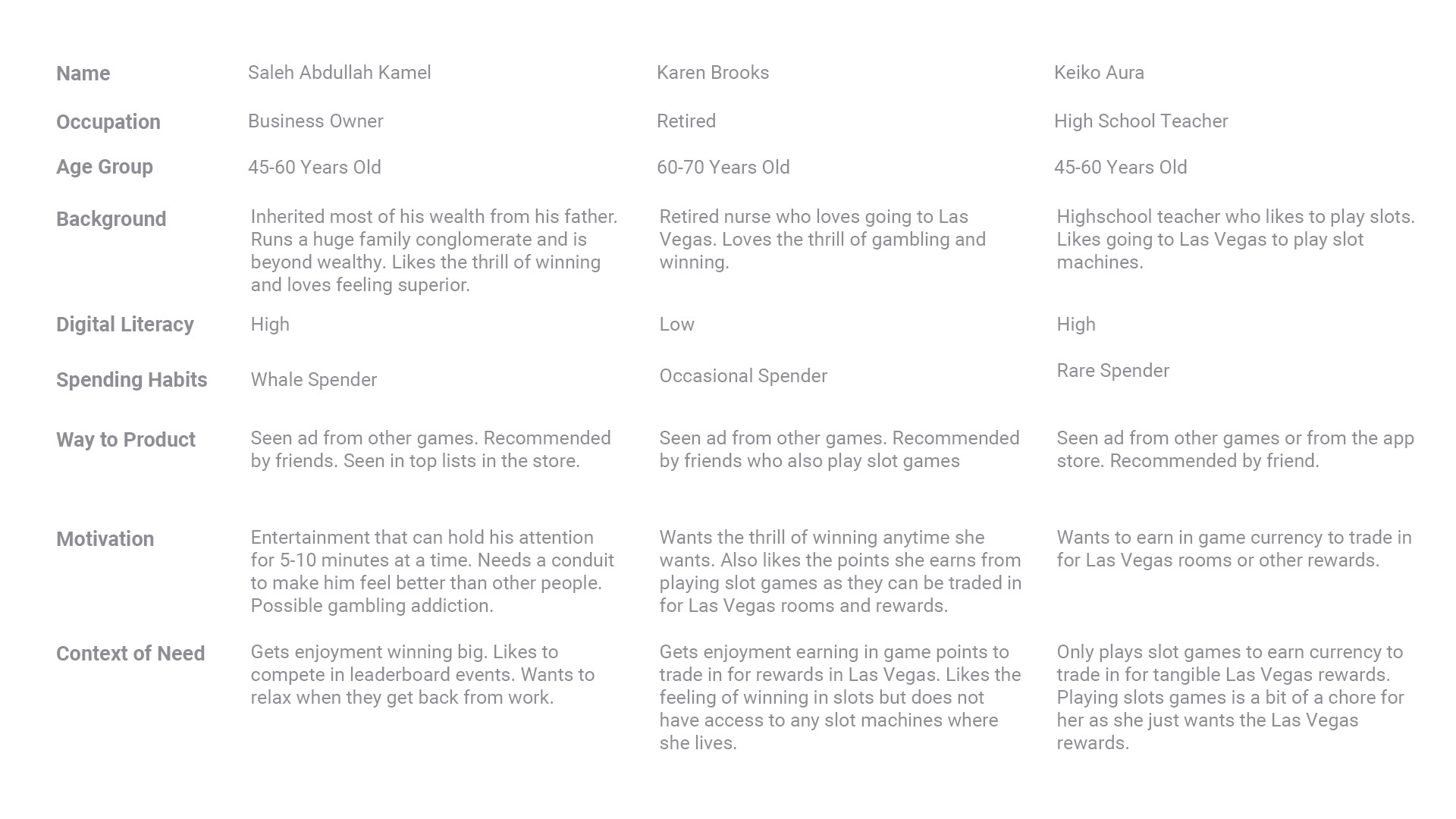
Personas help create a real world consideration when designing software. Defining these user groups allow designers to target specific user bases for the most optimal user experience. Defining personas for Jackpot Slots was very interesting as the target demographic were older women who had low digital literacy.
CHAOS BATTLE LEAGUE
User Flow Charts
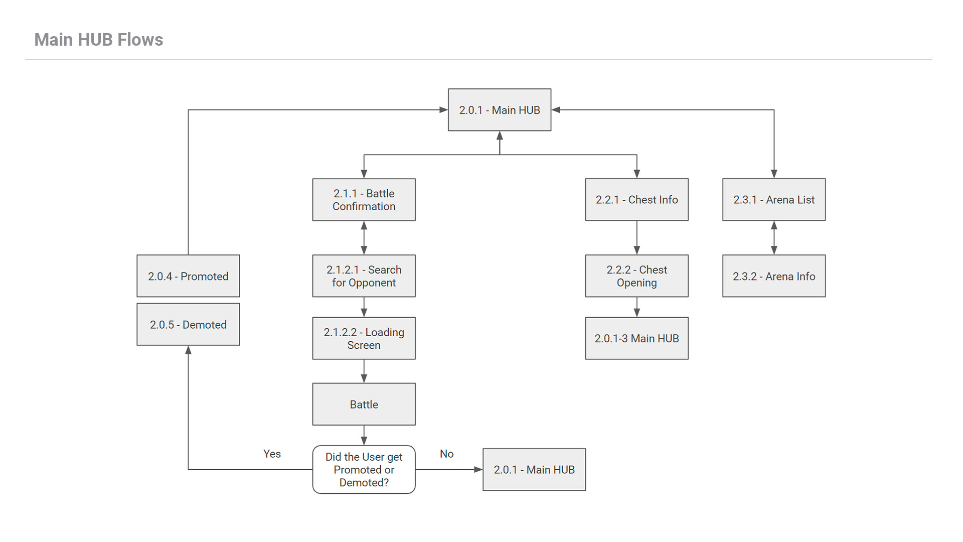
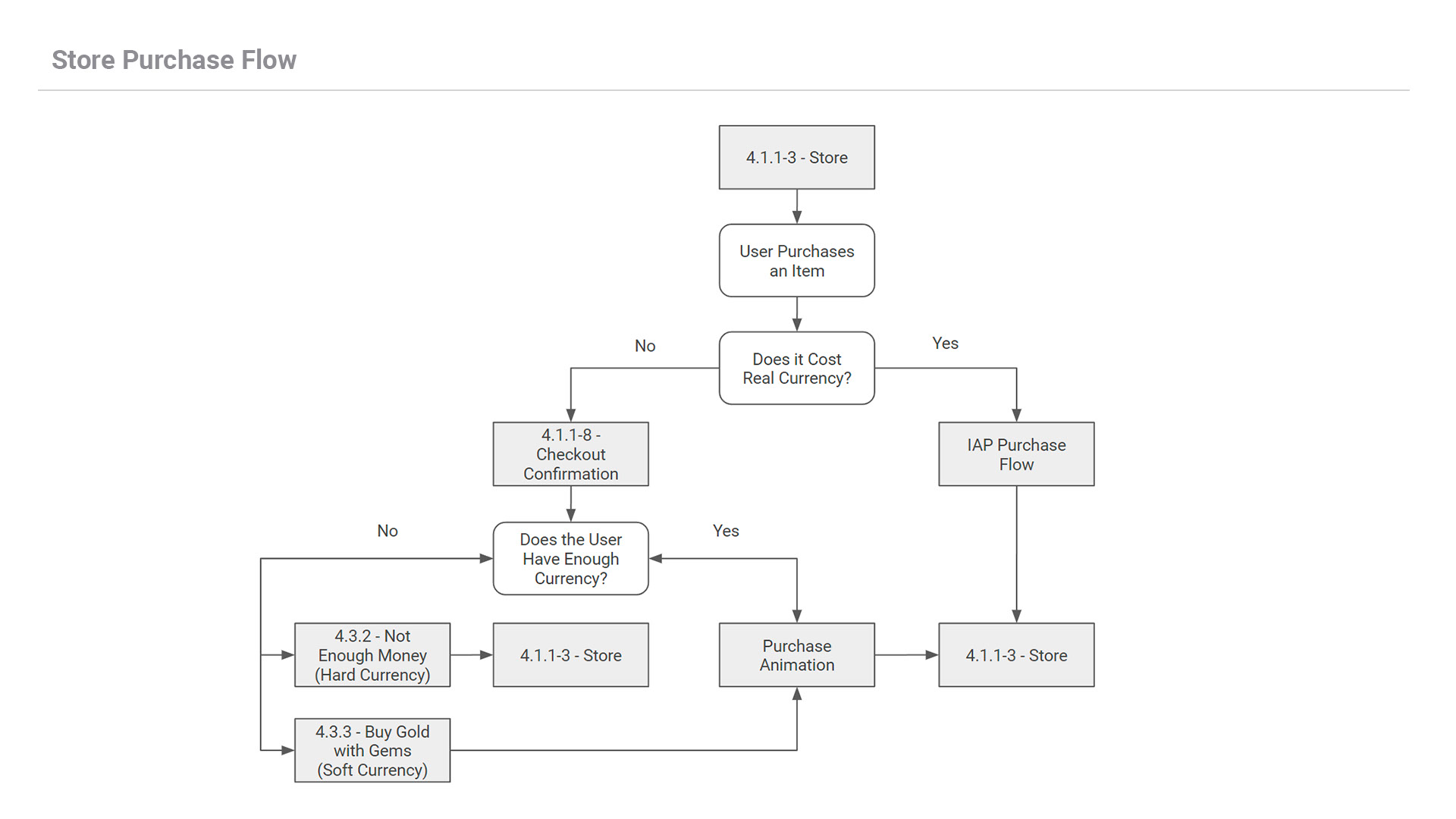
Flowcharts provide a high level workflow for a feature or task. For every feature of a game I develop high level flowcharts that dictates each screen and how they interact with each other. Here are a few examples from Chaos Battle League, a real time PVP strategic game.
Mighty Doom
Wireframes
