

MIGHTY DOOM
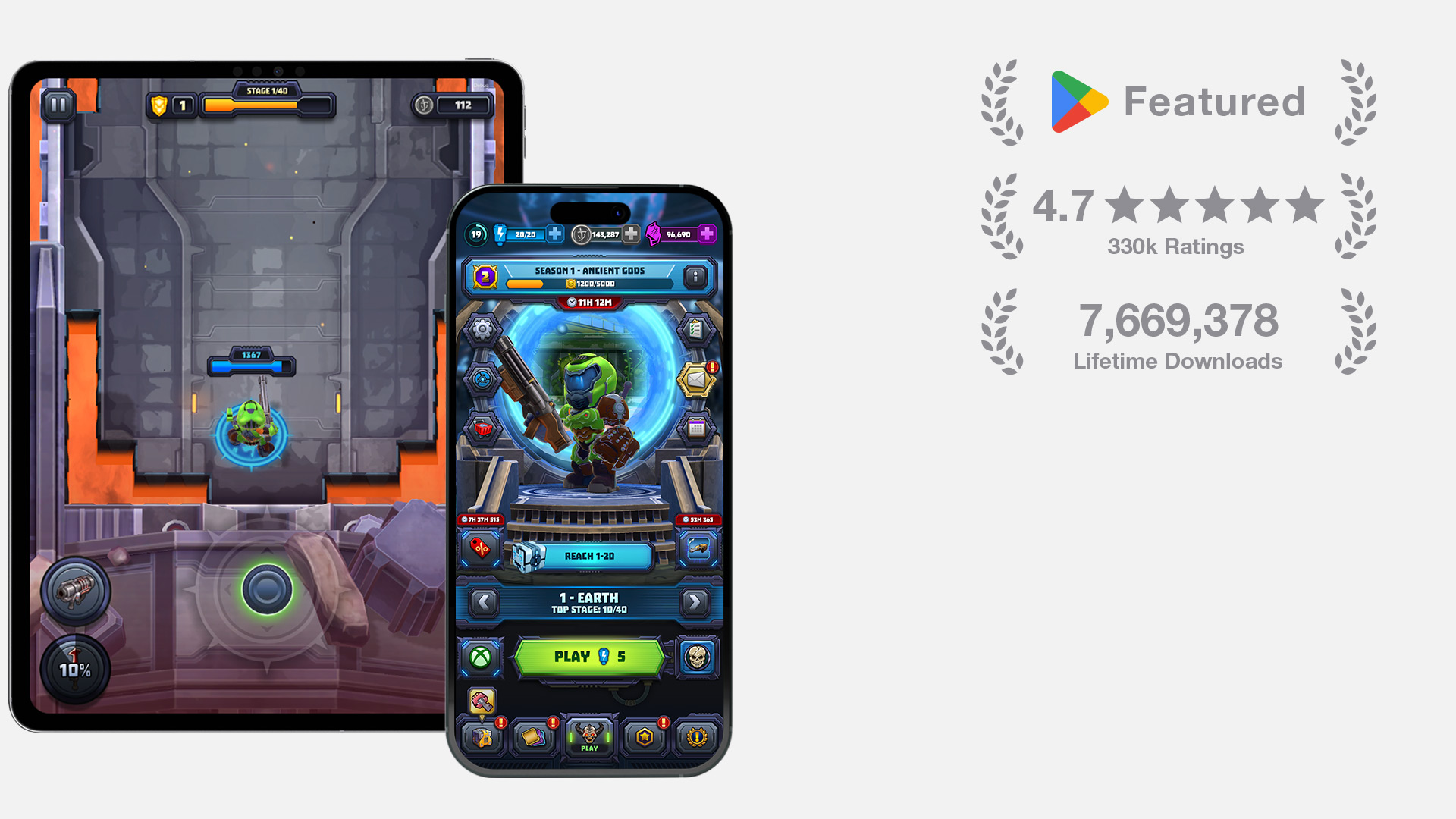
Mighty Doom is a free-to-play mobile action title with 7.6M+ lifetime downloads and a 4.7★ Google Play rating from 330k+ reviews. As the sole Principal UI/UX designer on the project, I owned the experience end to end across every major feature, from information architecture, user flows, wireframes, and visual design to production assets, motion design, and direct implementation in Unity uGUI.
Mighty Doom combined fast-paced combat with a complex metagame of equipment, upgrades, abilities, events, currencies, rewards, and purchases. My challenge was to make these interconnected systems clear and usable on a small screen while preserving the energy of the DOOM franchise and creating a flexible foundation for ongoing live content.
As the sole Principal UI/UX designer, I worked with producers, game designers, engineers, artists, and id Software to define requirements, user flows, hierarchy, and edge cases for each feature. I moved from annotated wireframes and high-fidelity layouts into functional Unity prototypes, then produced the final assets, responsive layouts, motion, prefabs, and animation files directly in Unity uGUI. This end-to-end approach allowed me to validate technical constraints early, maintain consistency across the product, and give engineers production-ready components rather than static design references.
INFO
PLATFORM
iOS, Android
DATE
2020-2024
SKILLS
UI/UX Direction, Information Architecture, Visual Design, Motion Design, Iconography, Design Systems, Unity uGUI Implementation
COMPANY

CORE LOOP AND MOMENT-TO-MOMENT PLAY
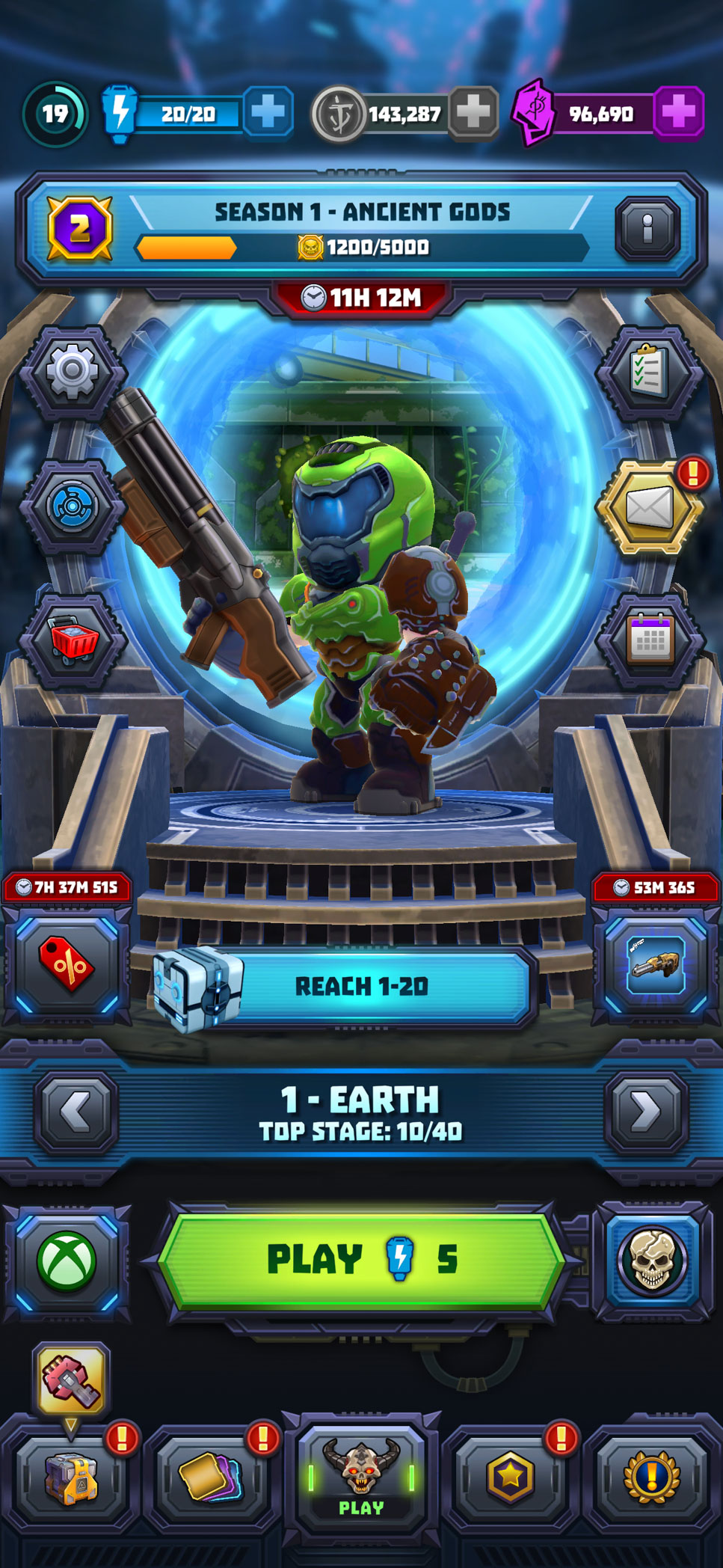
The core experience needed to move smoothly between preparation, combat, and rapid in-run decisions. I designed the main hub as the central entry point to progression, live content, equipment, and gameplay while keeping the primary play action visually dominant.
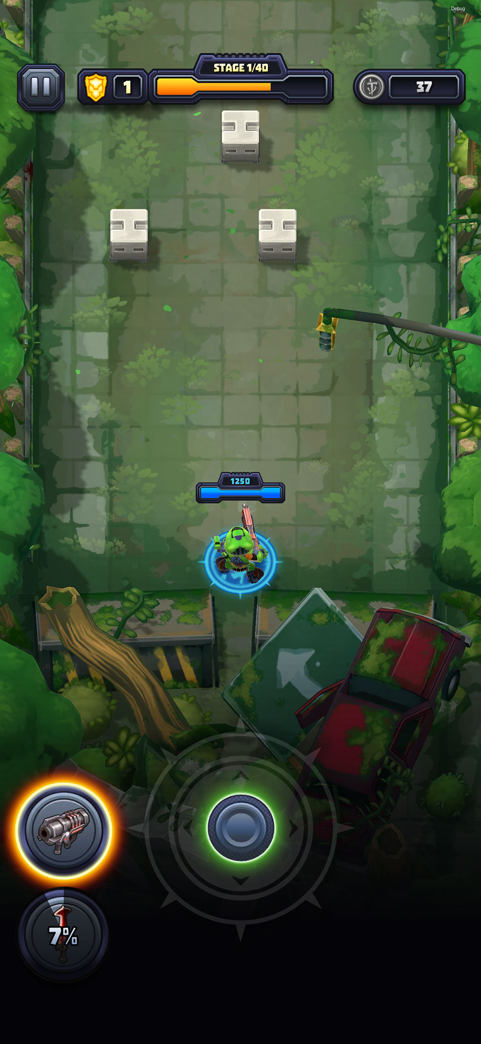
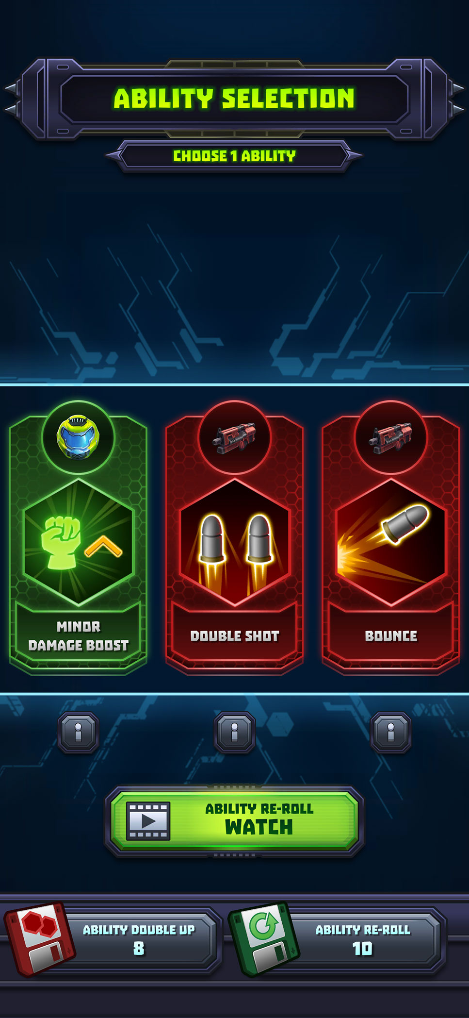
During combat, I kept essential information around the edges of the screen so health, stage progression, resources, weapons, and controls remained readable without obscuring the action. Between encounters, the ability-selection screen temporarily shifts the player into a focused decision state, presenting each option with a recognizable icon, concise benefit, rarity treatment, and clear selection area. Together, these screens establish the game’s central rhythm: prepare a build, enter combat, make meaningful choices, and continue progressing with minimal friction.
PROGRESSION, LOADOUTS, AND PLAYER BUILDS
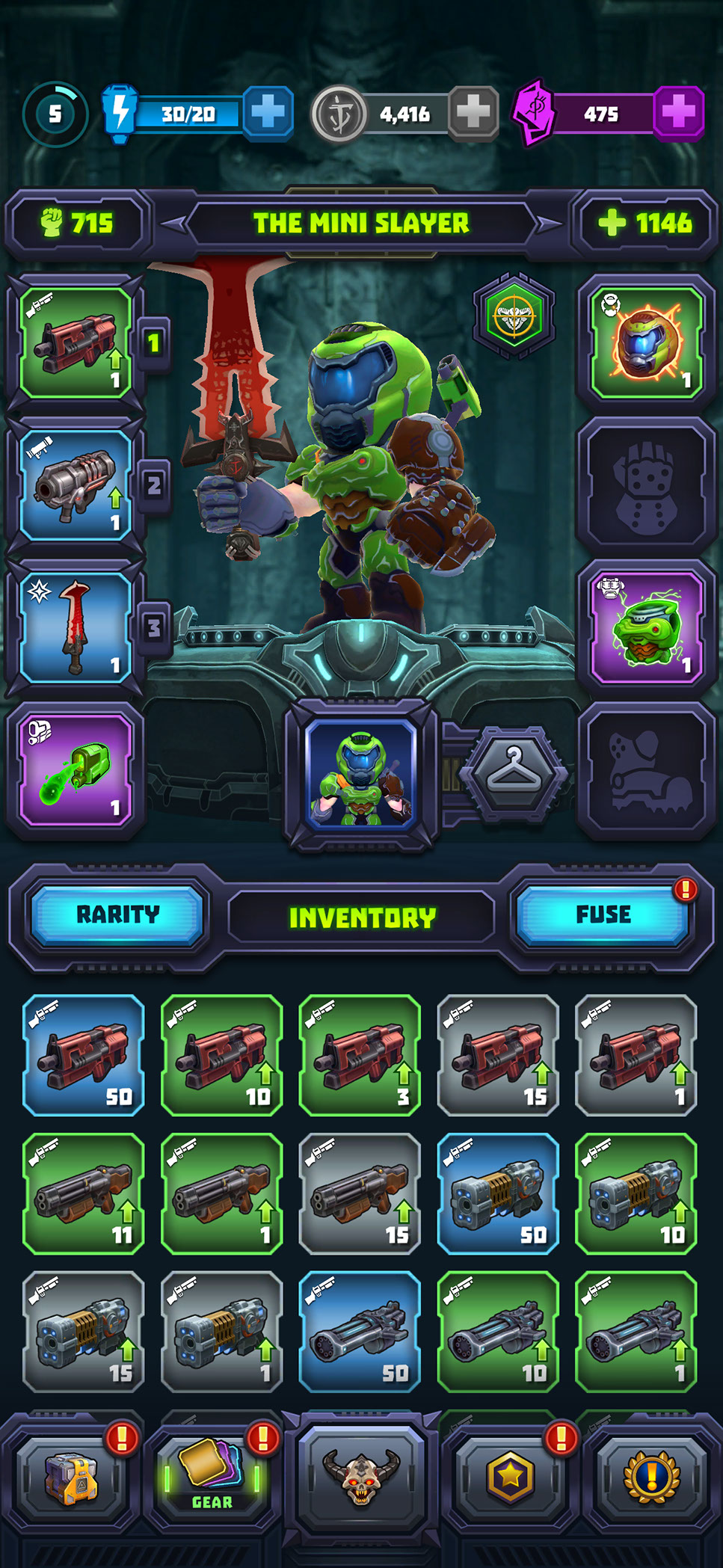
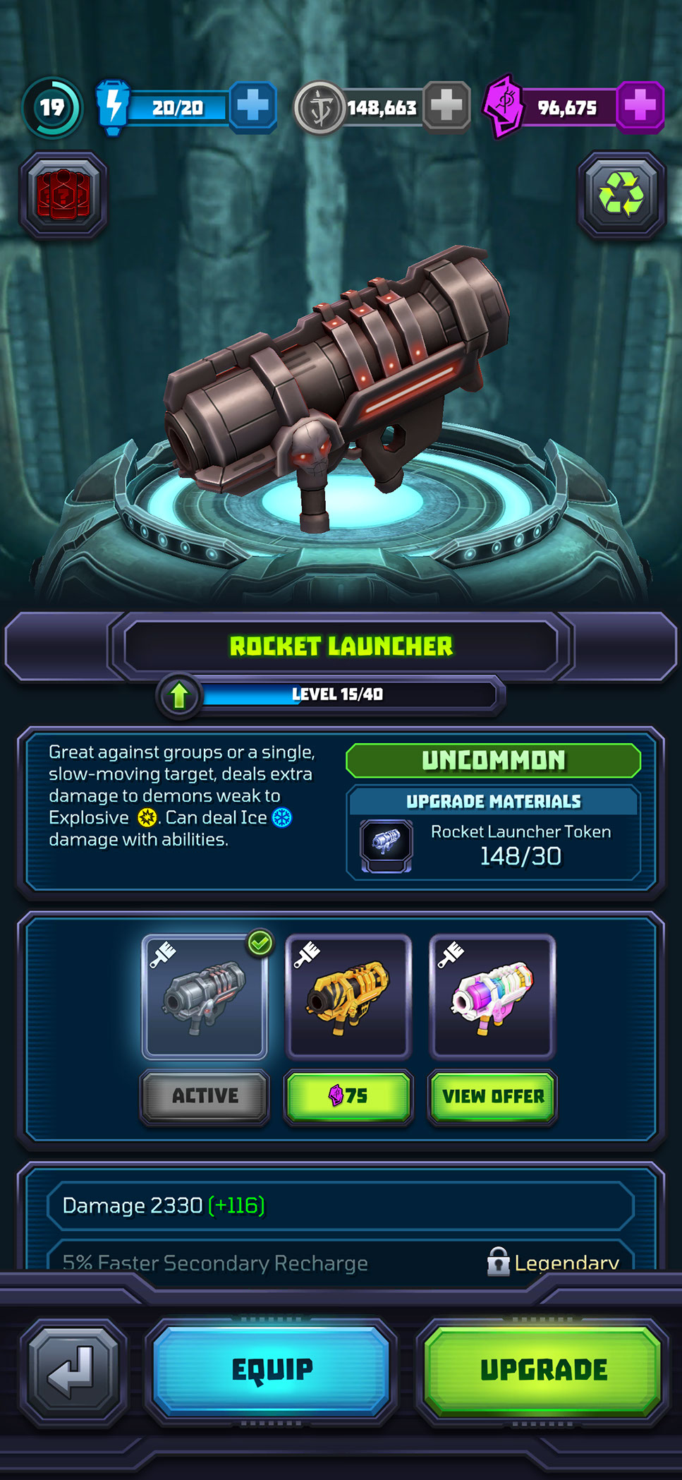
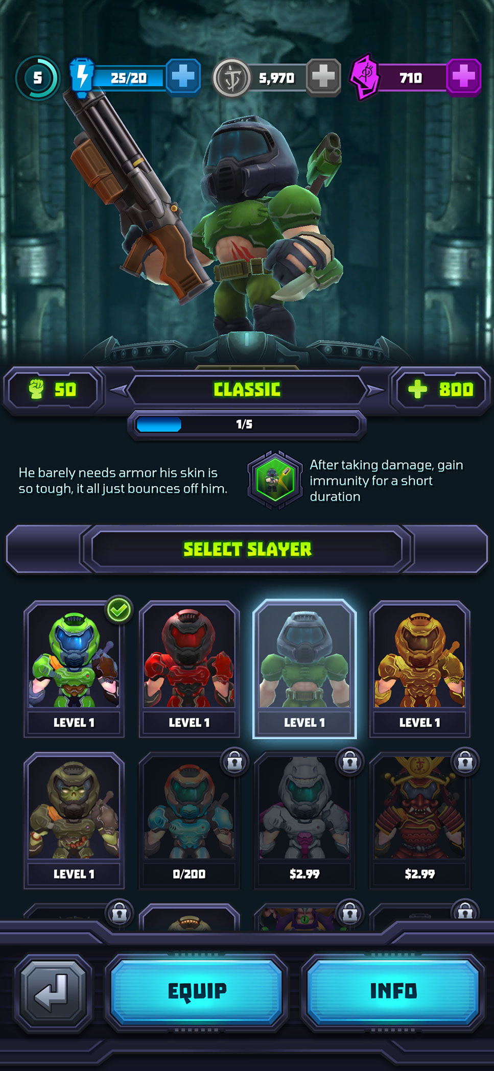
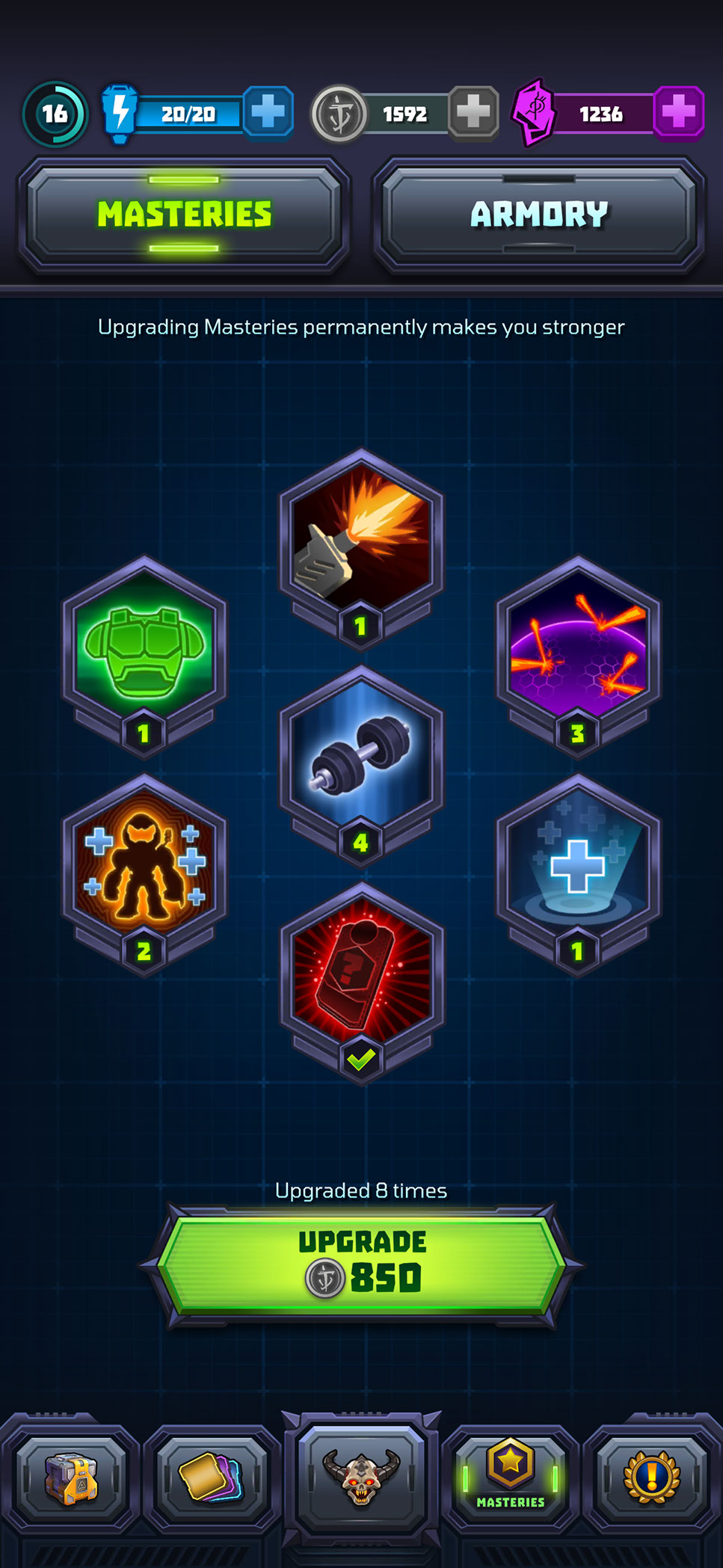
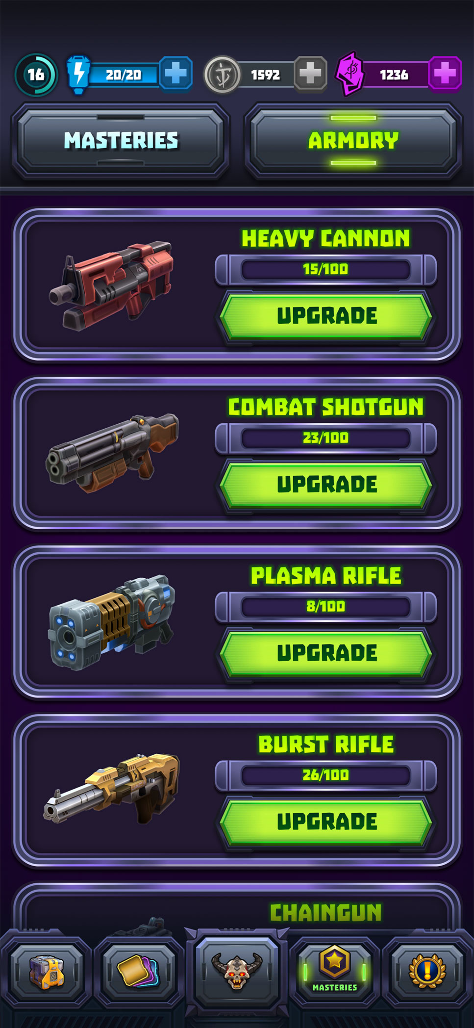
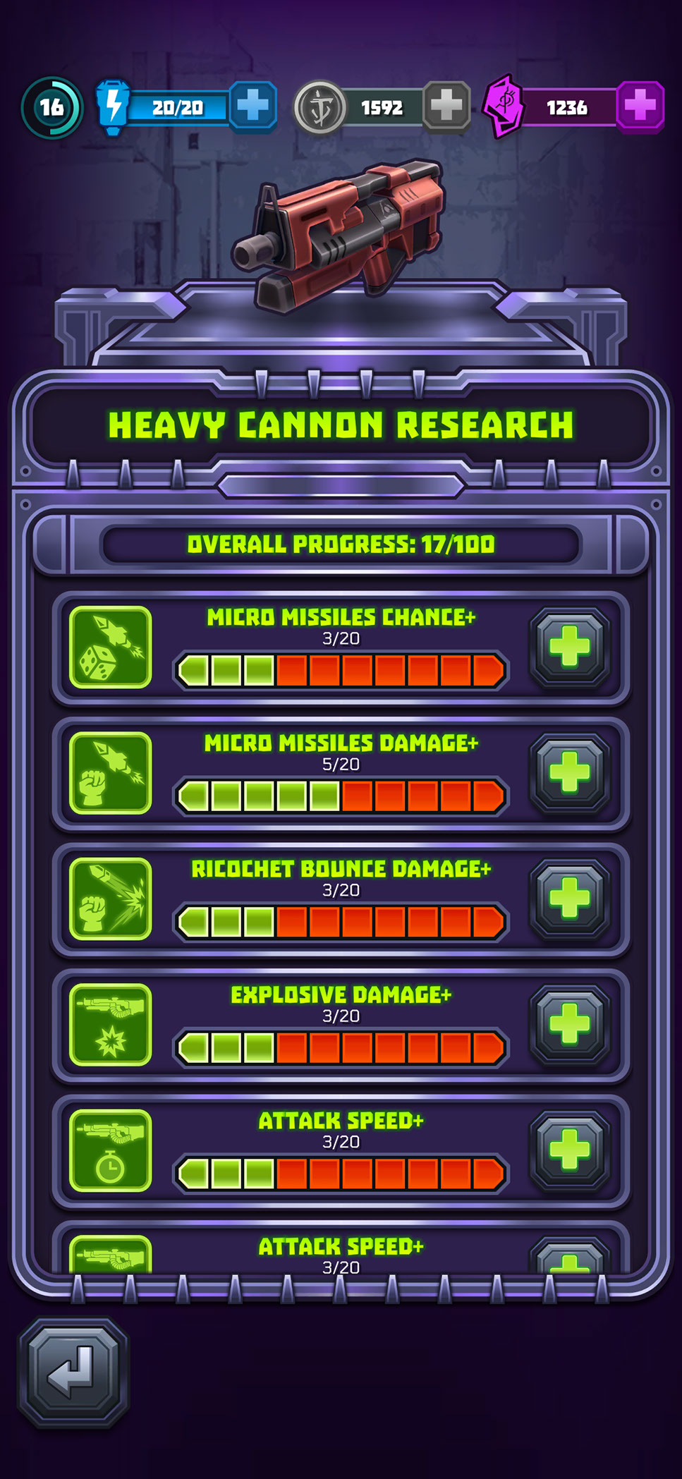
Mighty Doom contained several interconnected progression systems, including equipment, weapon upgrades, Slayer selection, Masteries, and Armory. The central UX challenge was helping players understand what they owned, what was equipped, how each item affected their build, and which resources were required for the next upgrade.
I established a consistent visual language using reusable item cards, equipment slots, rarity treatments, progress indicators, resource requirements, and action states. Equipment and Slayer screens prioritize identity, current power, attributes, customization, and available actions, while Masteries, the Armory, and weapon research translate longer-term progression into clear milestones that make incremental advancement easy to understand.
STORE, OFFERS, AND PURCHASE FLOWS
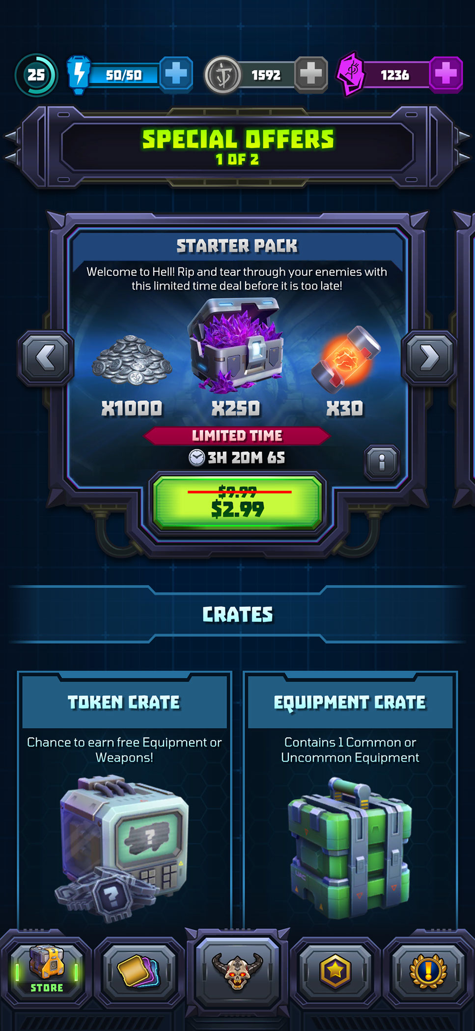
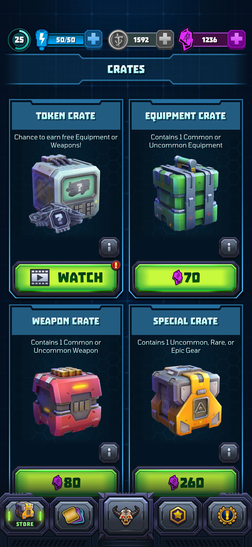
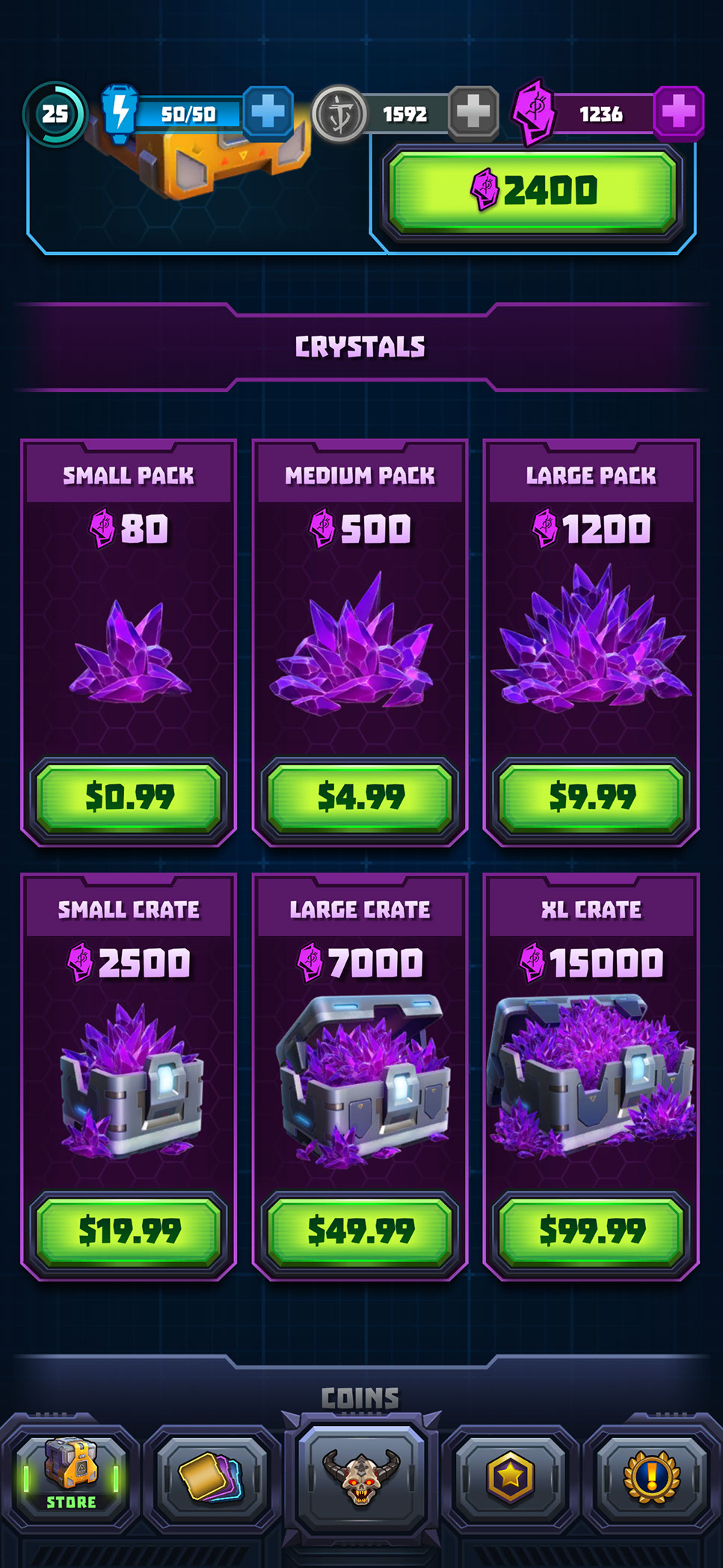
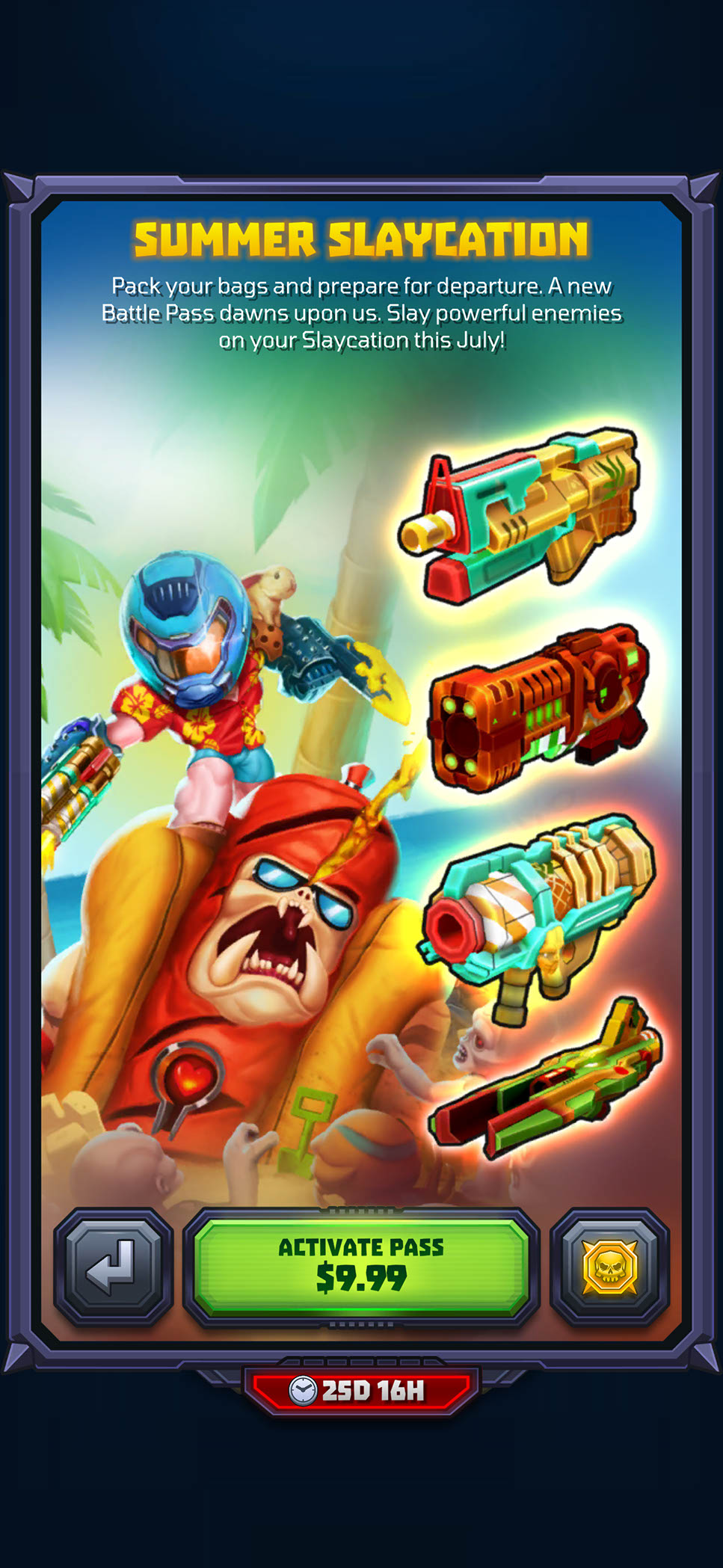
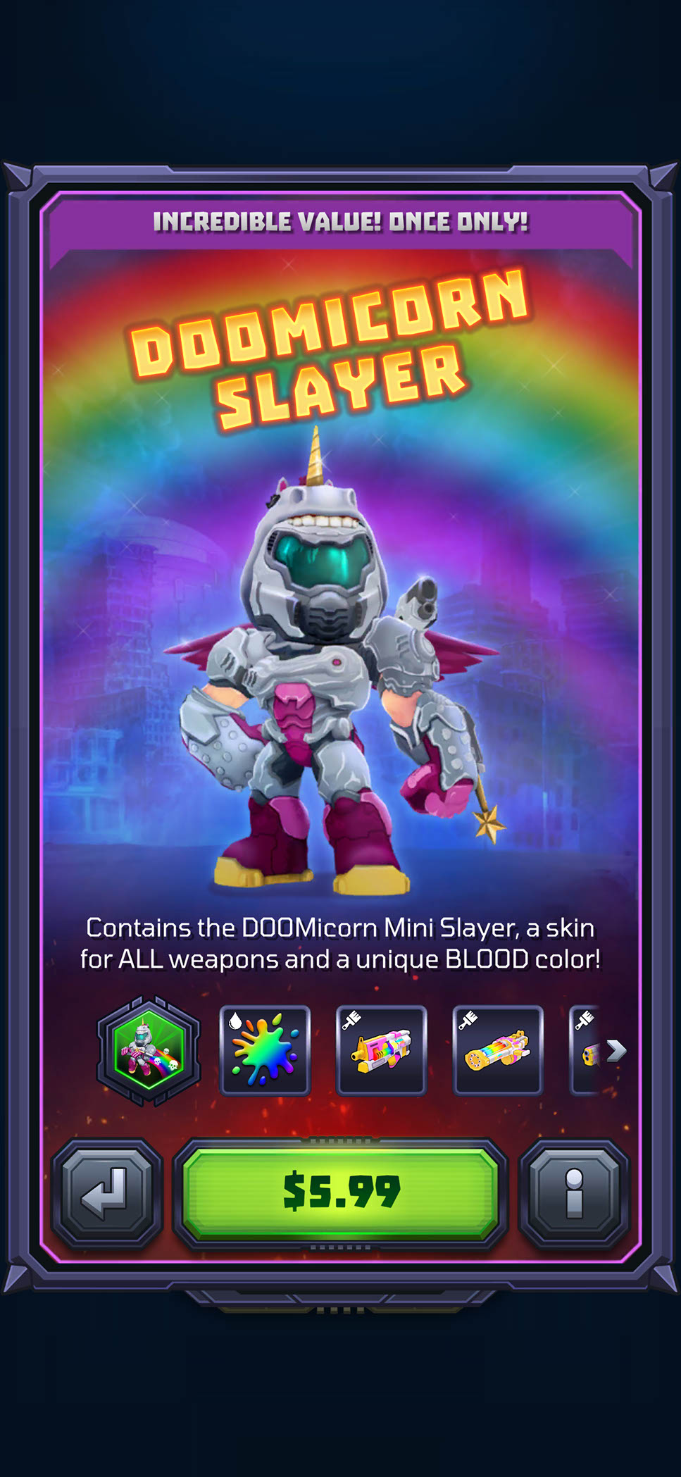
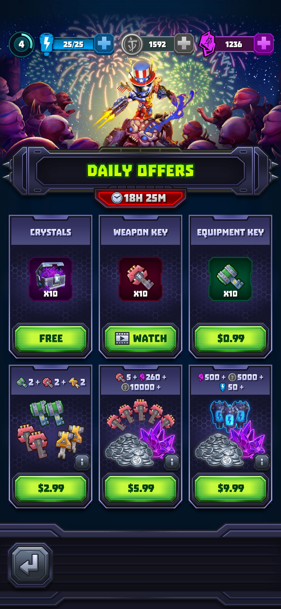
The store supported several purchase models, including limited-time bundles, randomized crates, premium currency packs, daily deals, seasonal passes, progression shortcuts, and character-themed offers. I created reusable layouts that gave product contents, quantities, pricing, timers, and purchase actions consistent placement, helping players understand what they would receive before committing.
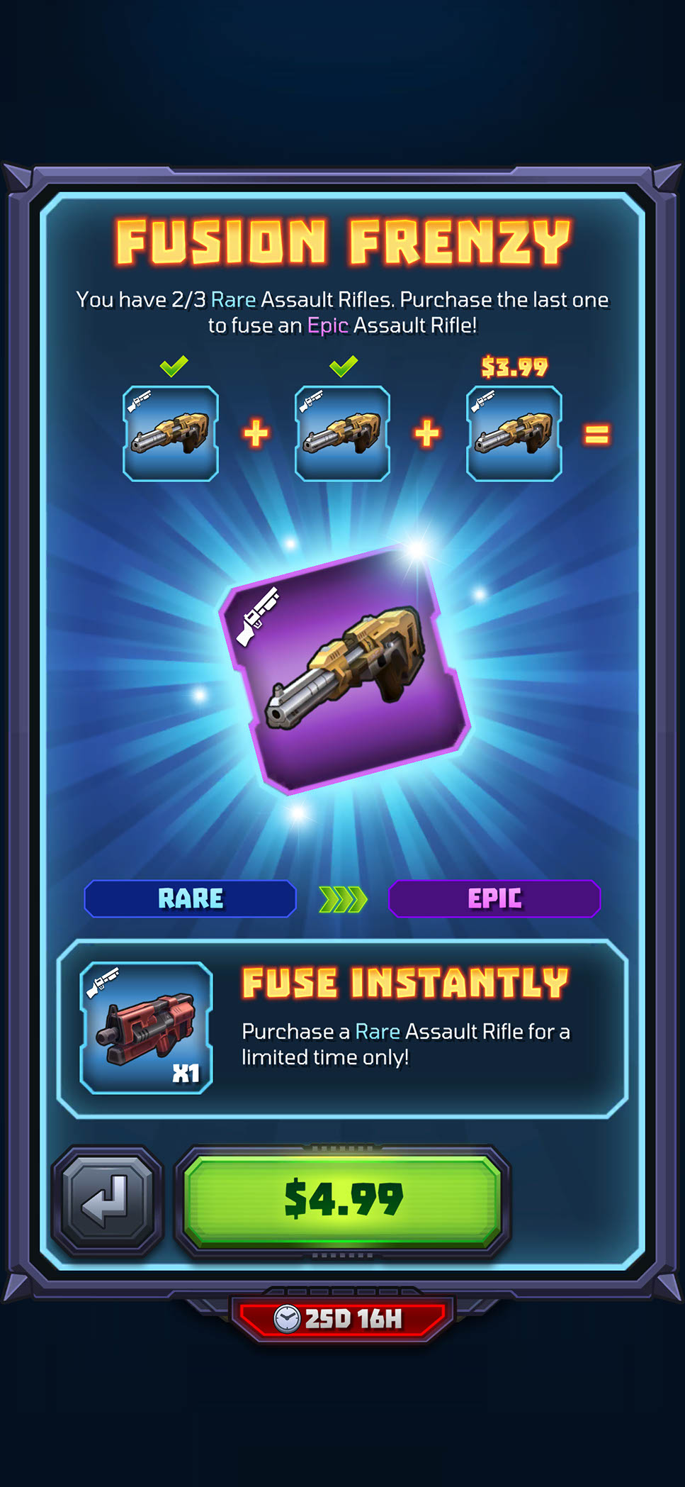
More specialized promotions required tailored presentation without introducing an unfamiliar interaction model. Fusion Frenzy explains a feature-specific upgrade opportunity, while seasonal and character bundles use stronger artwork to highlight their theme and included rewards. This modular approach allowed live offers to feel distinctive while remaining part of one coherent store experience.
LIVE OPERATIONS AND DAILY ENGAGEMENT
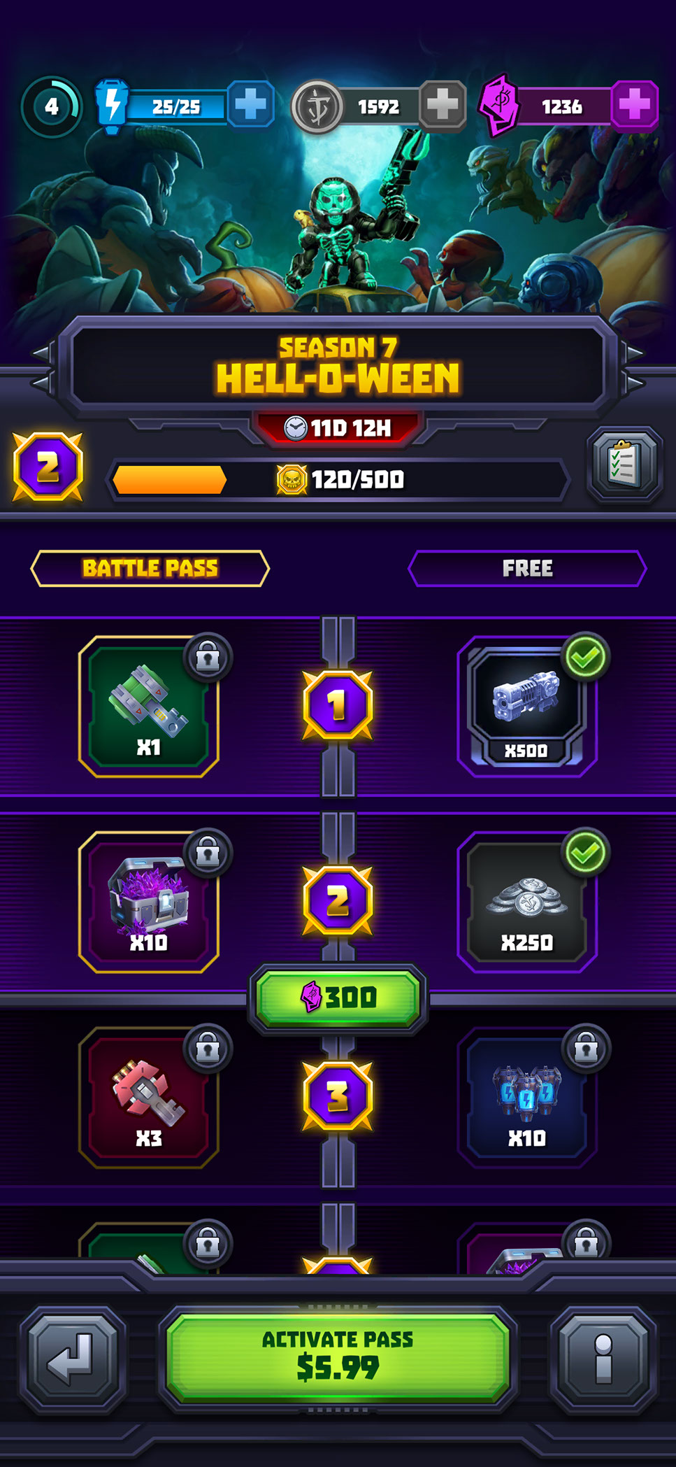
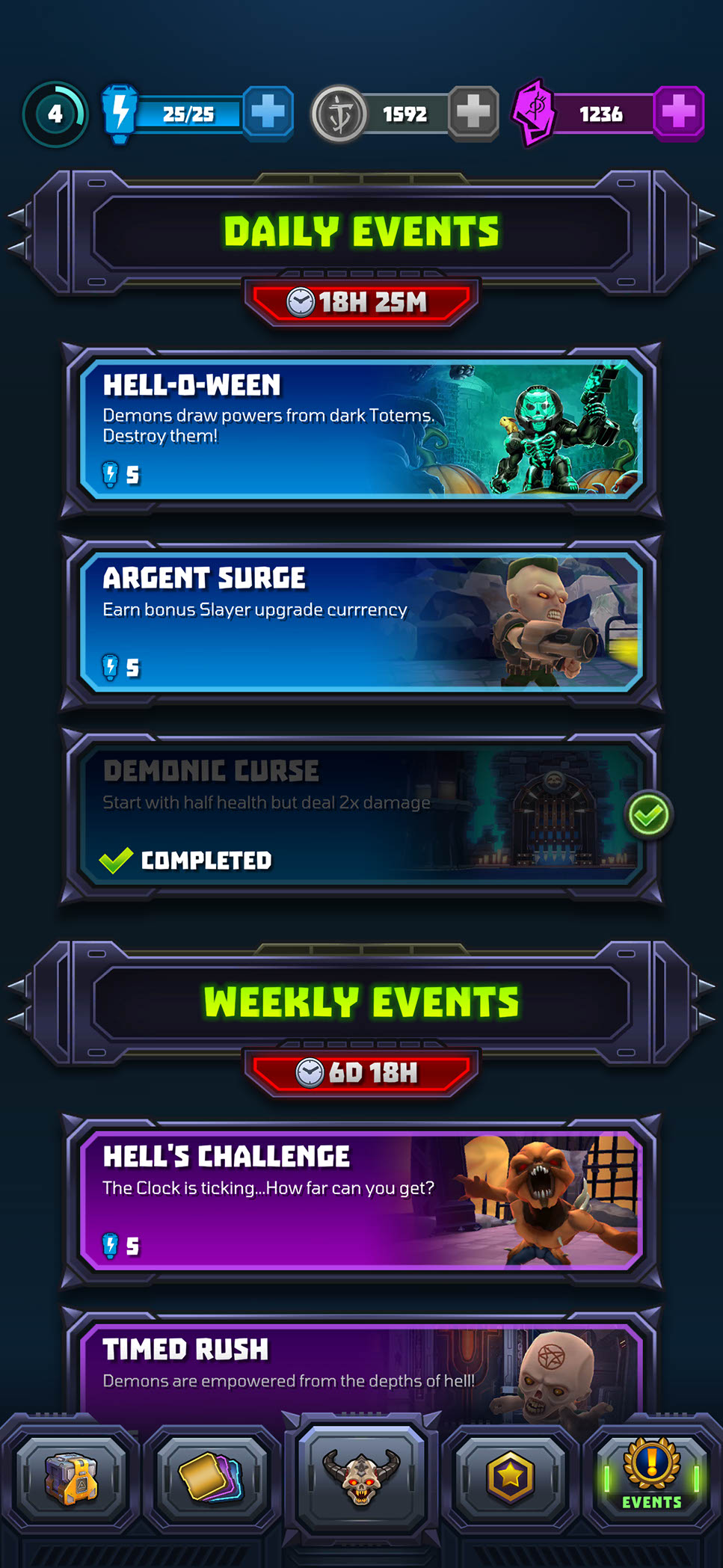
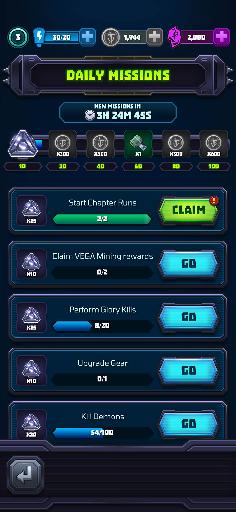
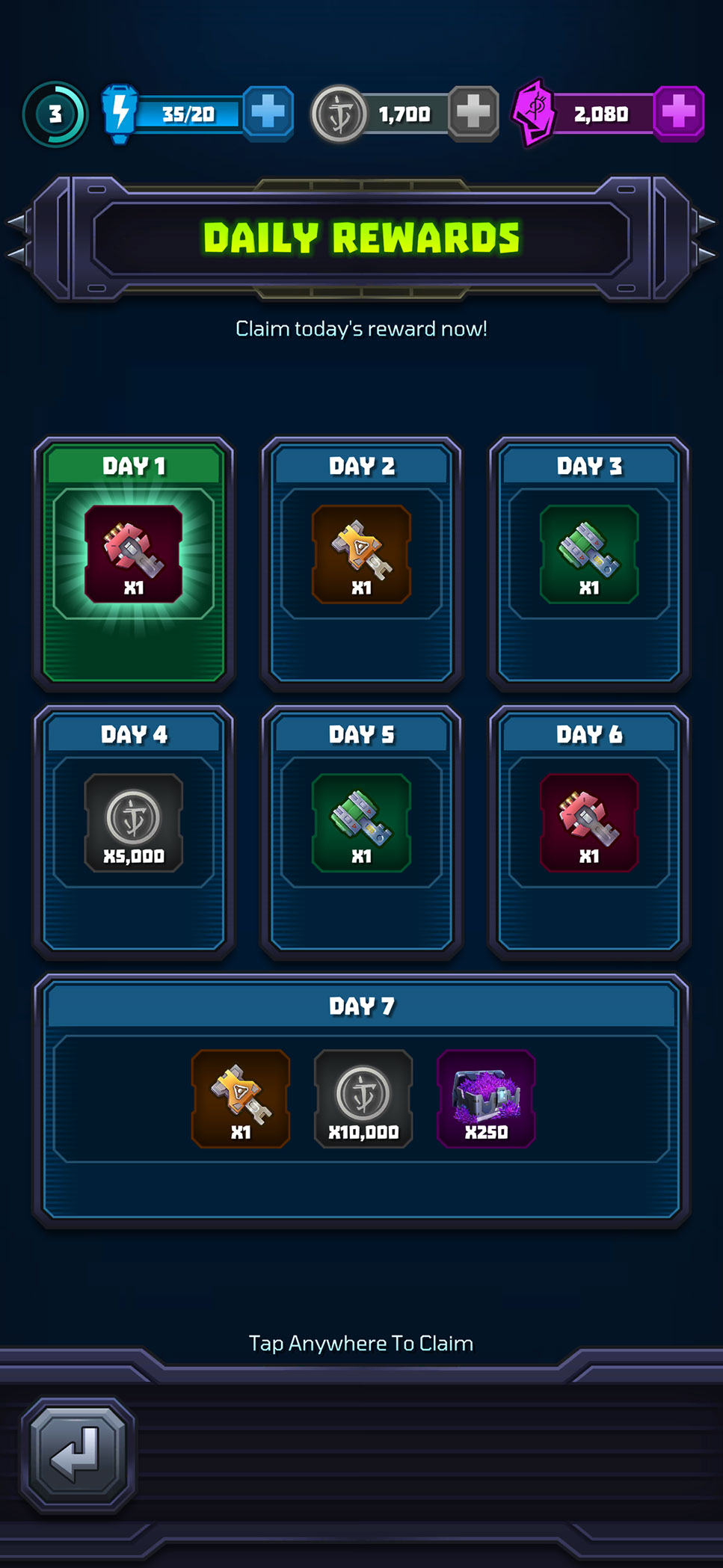
Mighty Doom used a range of recurring systems to give players clear short- and long-term goals between runs. I designed the Battle Pass, daily and weekly events, missions, rewards, and rotating offers around consistent timers, progress states, notification cues, and claim interactions so players could quickly understand what was available, what was in progress, and what was ready to collect.
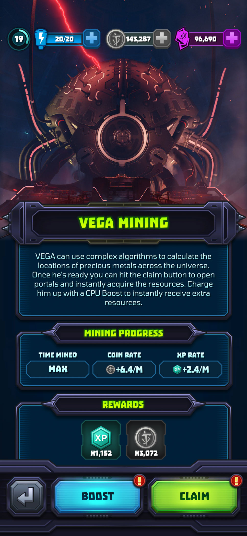
Vega Mining added a passive progression loop by allowing players to accumulate resources over time, then return to boost or claim their earnings. Across these systems, I used shared patterns for locked, active, completed, and claimable states while giving each feature enough visual identity to remain distinct.
RESULTS, UNLOCKS, AND UPGRADE FEEDBACK
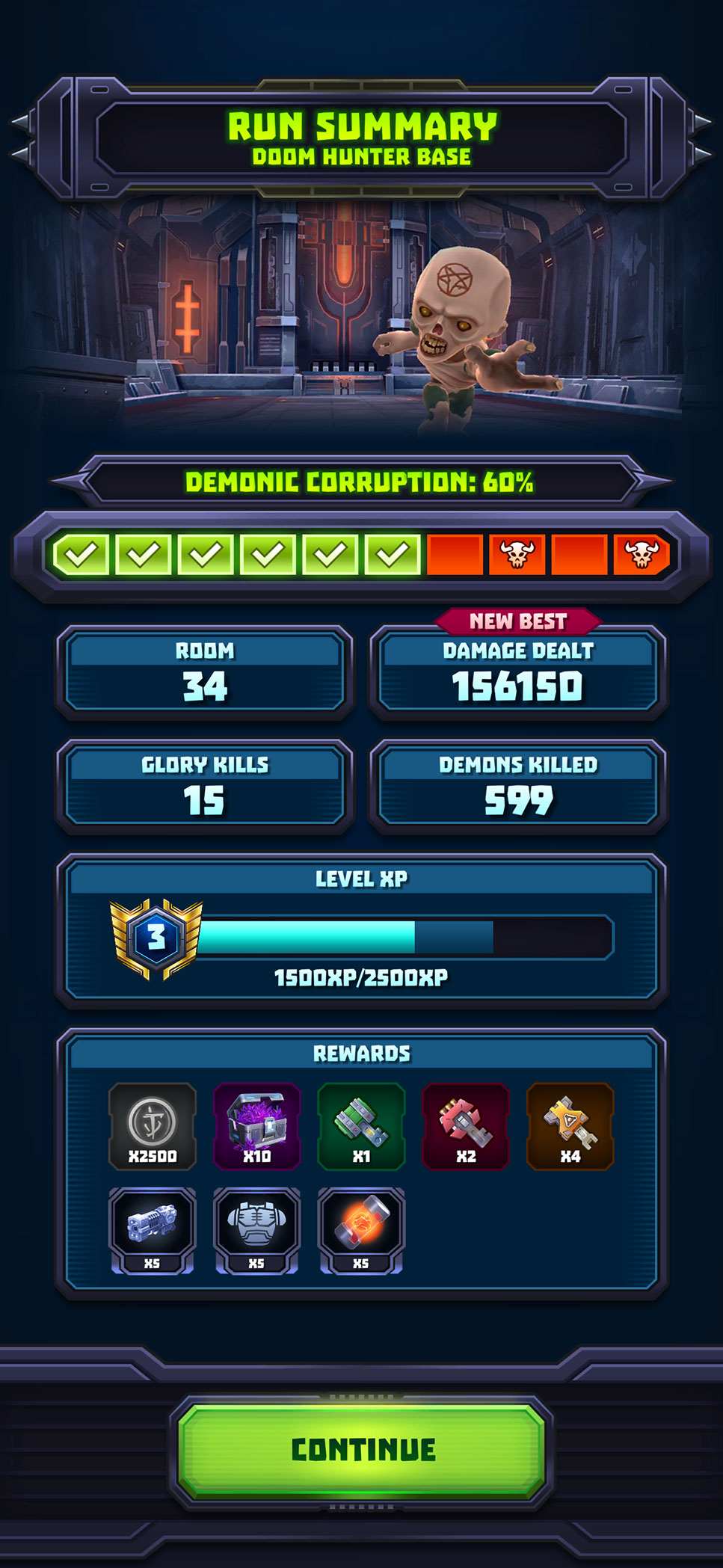
At the end of a run, the summary screen consolidates chapter progress, performance, experience, and collected rewards into a clear sequence before presenting a single continuation action. The hierarchy begins with the overall outcome, moves through the player’s results, and concludes with progression and earned items.
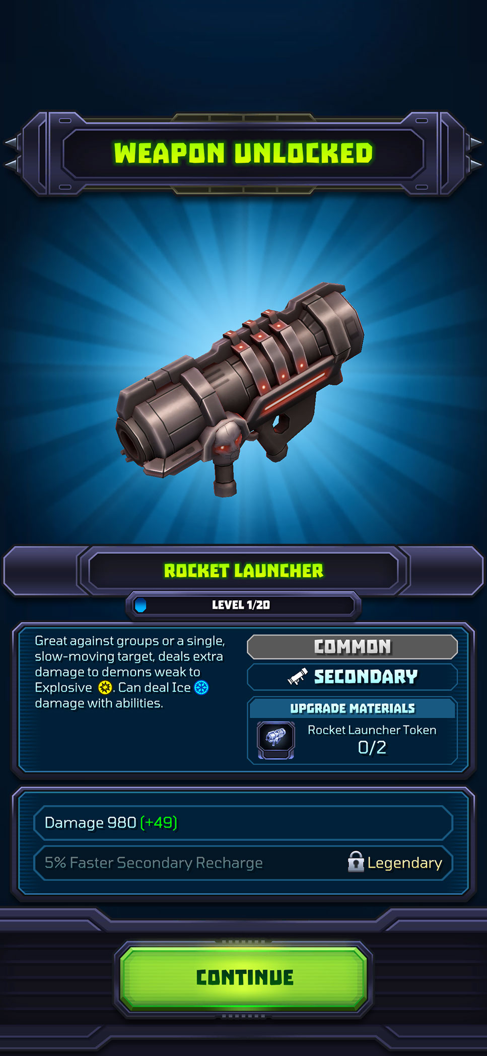
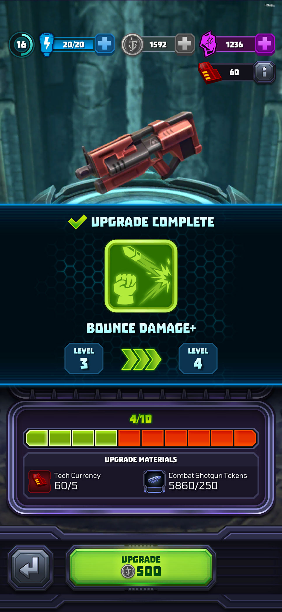
Weapon unlocks and upgrade completions create more focused reward moments. The newly acquired or improved item receives visual priority, while its level, attributes, materials, and gameplay benefit remain immediately understandable. These screens reinforce progress and celebrate meaningful upgrades without slowing the player down with unnecessarily long reward sequences.
ONBOARDING, CONSENT, AND CONTEXTUAL GUIDANCE
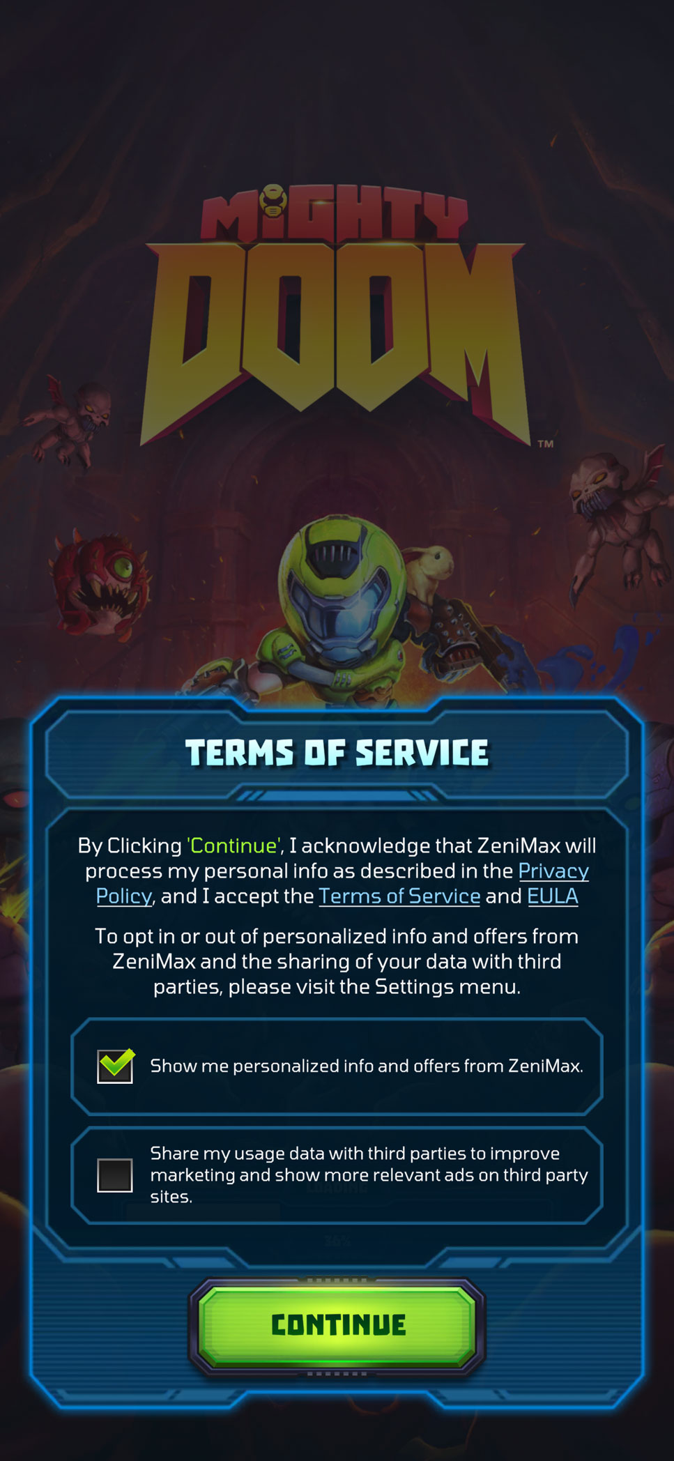
The opening experience needed to introduce required account and privacy choices without overwhelming players before they reached the game. I designed the Terms of Service and consent screen with clearly separated options, readable supporting information, and a dominant continuation action.
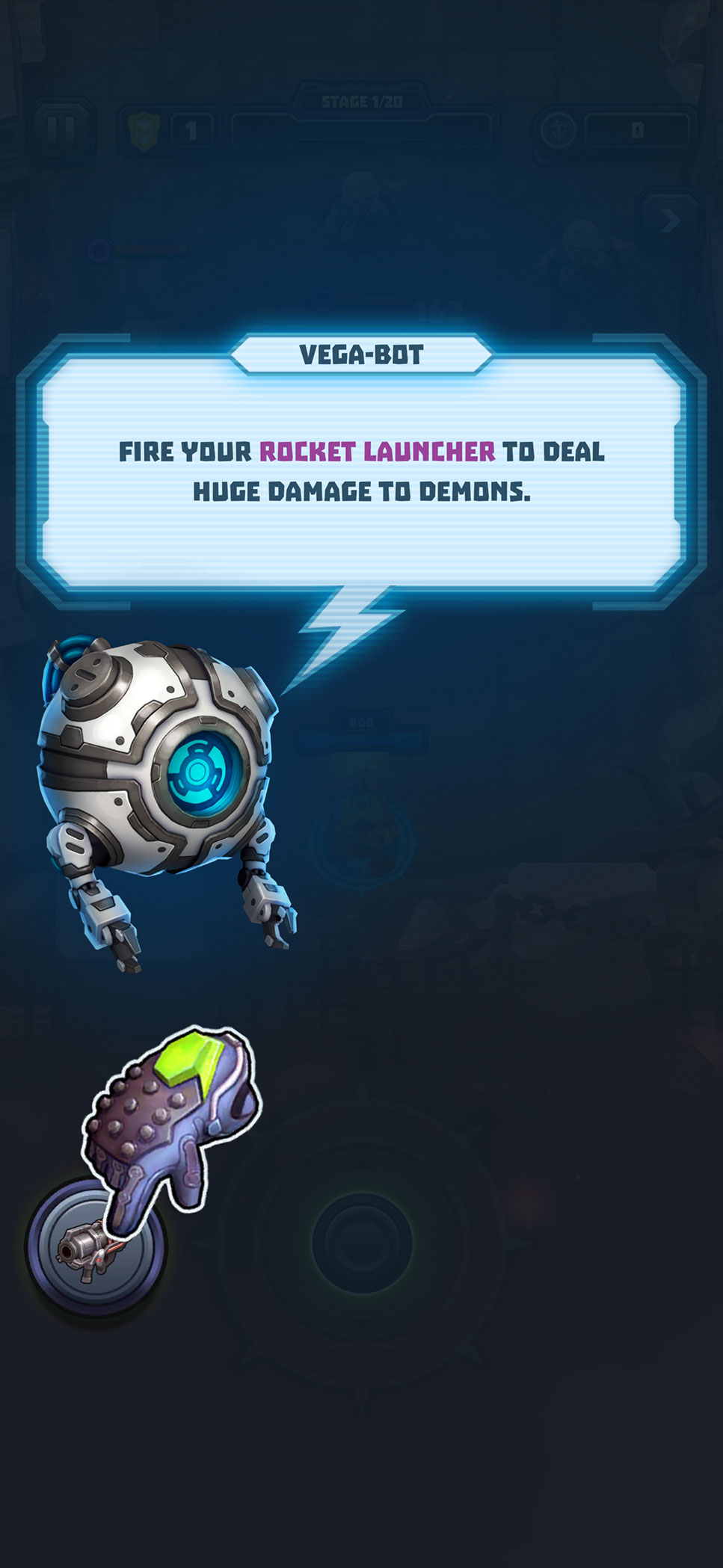
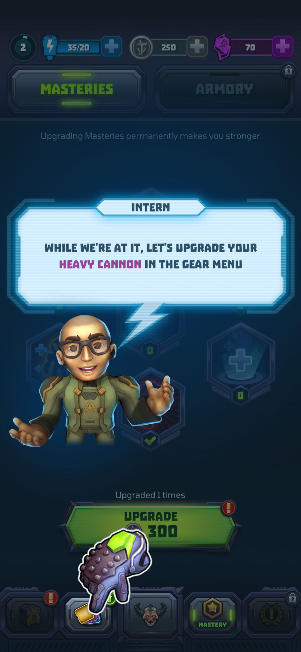
Once gameplay began, contextual tutorials introduced controls and progression systems at the moment they became relevant. VEGA-BOT and character-guided overlays combine concise instructions with dimmed backgrounds, highlighted interface elements, and animated hand cues to direct attention toward the required action. This progressive approach allowed players to learn within the live interface rather than relying on a long standalone tutorial.
MOTION DESIGN
I designed and implemented the interface motion directly in Unity. The final animation files were used in the released game, allowing engineers to integrate production-ready sequences with minimal additional setup.
Motion was used to reinforce player feedback, establish hierarchy, communicate changing states, and add energy to important progression and purchasing moments. Each treatment was designed to remain readable and performant on mobile while supporting the fast, exaggerated personality of Mighty Doom.
Examples included a promotional treatment for Weapon Fusion, a weapon-unlock sequence, and an Armory upgrade-completion animation. Timing, anticipation, particle bursts, light sweeps, and short completion loops were used to strengthen reward presentation without delaying the player’s next action.
TOAST NOTIFICATIONS
I designed the UI and motion system for toast notifications to communicate progression updates without interrupting active gameplay.
The widget was constructed entirely from Unity components and dynamically adapted to different message lengths and notification types. A short slide-in established visibility, a controlled hold allowed the message to be read, and a smooth exit returned attention to gameplay.
I explored several motion variants before selecting the third direction, which provided the best balance of visibility, pacing, readability, and screen coverage. Because the layout and animation were already assembled in Unity, the system required significantly less engineering setup.
HUB ATTENTION CUES
I also created subtle animation treatments for high-value actions on the main hub, including available Battle Pass progress and Daily Rewards. Short pulses, light sweeps, and restrained idle loops indicated that an action or reward was available without creating constant visual noise. Animation durations were deliberately brief to reduce fatigue on a screen players would visit repeatedly.
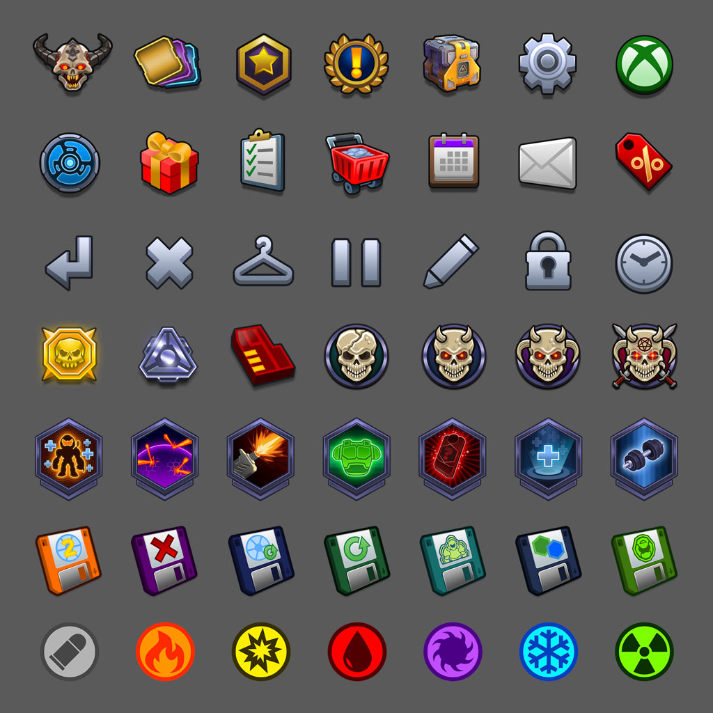
UI ICONOGRAPHY & TEXTURES
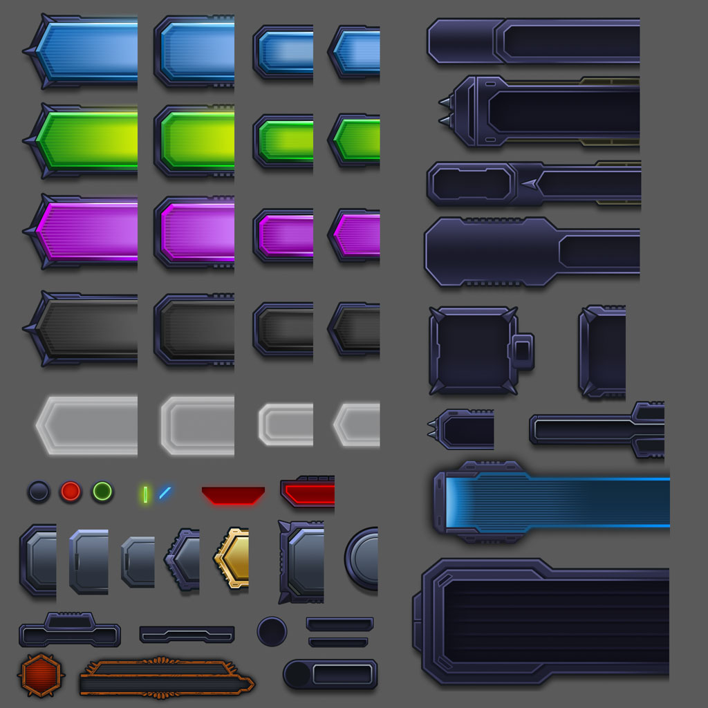
I personally created the game’s interface iconography and a substantial library of production UI textures across navigation, gameplay, progression, events, and monetization systems. Working with the Art Director, I helped establish a visual language that combined DOOM’s aggressive industrial character with the clarity required for a mobile interface. Icons were designed to remain recognizable at small sizes while still feeling consistent with the broader game aesthetic.
I also defined the presentation and rendering approach for 3D equipment icons and key art used throughout the interface. Templates and guidelines gave 3D artists a repeatable process for producing assets for new content and live events. Within Unity, I configured import settings, reusable sprites, nine-sliced components, and texture optimization to minimize memory requirements while preserving visual fidelity. All work was reviewed with id Software to ensure the interface remained authentic to the DOOM franchise and visually consistent across every part of the game.
OUTCOME
The final product contained a cohesive UI/UX system spanning gameplay, progression, player customization, onboarding, live events, monetization, settings, and rewards. By owning the process from UX architecture through Unity implementation, I was able to preserve the original design intent, identify technical constraints early, reduce handoff friction, and give the engineering team production-ready components that could be integrated and expanded efficiently.
Mighty Doom ultimately reached more than 7.6 million lifetime downloads on Android alone and maintained a 4.7-star Google Play rating from over 330,000 reviews. The project demonstrates my ability to solve complex product and UX problems while also delivering the visual design, motion, assets, systems, and in-engine implementation required to ship and operate a large-scale mobile game.